Drawing and Painting Clouds
There are so many types of clouds and even more approaches to drawing and painting them.
To draw the shapes accurately, just like with figures or trees, there are some specific 'anatomical' features of each kind of cloud.
Download and print the chart and notes on types of clouds, general tips study a bit about them, then collect photos of clouds you would like to include in your drawings and paintings. This will come in handy over the years.
CLOUD CHART-jpg
CLOUD PDF- Drawing and painting clouds: general tips as below in pdf format
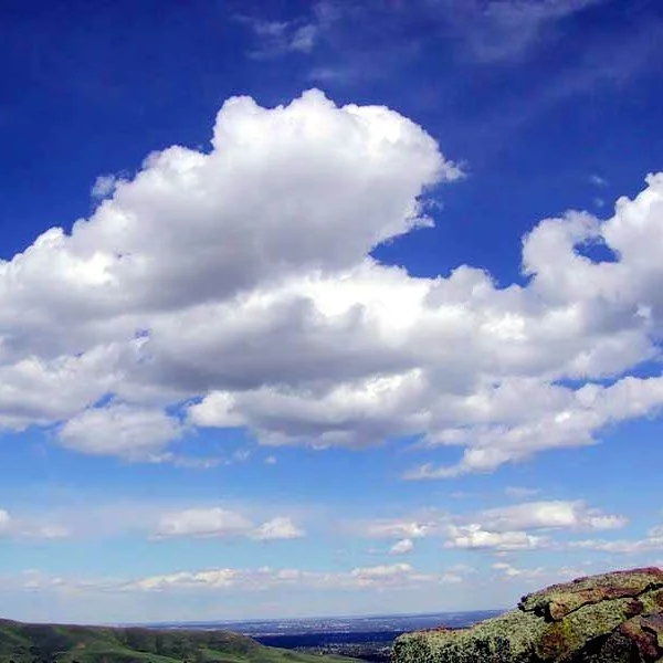
CLOUD EXERCISE 1 (Below on this page) Cumulus clouds in sun
CLOUD EXERCISE 2 - Soft glowing diffuse evening light (Same login)
PAINTING SKIES & CLOUDS
To follow are some general and also some more specific helpful and interesting hints to help with projects that include skies and in particular, clouds
· In bright skies with few clouds, often the shadow colour of the cloud is lighter in tone compared to the blue tones higher up
· Clouds cast shadows onto each other, so remember to observe the form shadows as well as the cast shadows
· In general, less texture in the sky can help with the impression of it being further away from the viewer than the foreground and middle distance features.
· Another way we know clouds are further away (near the horizon) is that their shape changes, they flatten out more the further away they are
· Clouds in Sunset skies are fun and very good practice (but very cliché). Leave them til later if you are just beginning with skies.
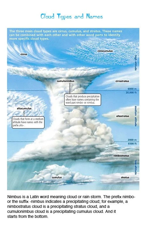
· It is very helpful to study and remember the different types of clouds eg. Cumulus, nimbus etc.(see the chart on this)
· As for getting believable shapes, sometimes artistic license comes in handy, as what looks ok in a photo may not necessarily be the best arrangement of shapes in your own composition (assuming you are creating beautiful, clever compositions, not just attempting to copy photos!!) Cloud shapes can be employed very cleverly to lead the viewer through your composition in an important part of your overall design.
· The ‘Fishbowl effect’ - Sometimes to give the feeling of the higher area of sky advancing over the head of the viewer and the horizon being further away, a subtle gradation of warm blue through to cool blue can be used while getting lighter and also more neutral towards the horizon. (because warmer colours appear to advance ie. The sky above us which is at the top of the scene, and the cooler areas appear to recede.)
· Solar Glare Effect - The sky gets lighter nearer the sun so when blocking in your sky colours, before moving onto clouds, try showing this feature, depending on the time of day, the lightest tones can even be slightly golden in hue (later in the day). Remember that the sky changes in value vertically and also horizontally, albeit at times very subtle. Also, remember that if using a ‘golden glow’, don’t blend it with the wet blue or you will get a ‘green glow’ instead.
PAINTING PROJECT 1 - CUMULUS CLOUDS IN SUN
Read through first and gather all required materials.
MATERIALS: 3-4 cm flats, synthetic or hog hair, short-haired
hog flat or round for stumbling.
A 5cm taklon or another soft synthetic flat brush.,
Water mister bottle,
PAINTS: warm dark blue (eg. Ultramarine blue), cool light blue
( eg.phthalo + white, cerulean + white), burnt umber, titanium white.
(I have a possible idea for my future scheme so I will use a light beige
near the horizon, you could use a touch of red with the two blues
and mostly white to arrive at the neutral violet tint seen in the
photo's horizon. I will be making my grey cloud shadow from
brown and blue, you could make a grey violet with red, ultramarine
and a touch of primary yellow to neutralize. The grey of the cloud
shadow is best made with harmonious scheme colours in mind.
(the tones are as important if not more important than colours
in the end result.
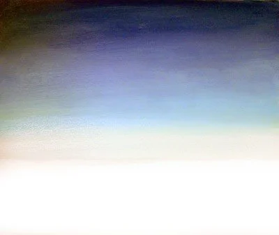
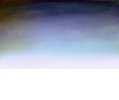
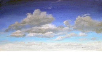
STEP 1
You can decide later what to paint below into this landscape, so divide
your canvas accordingly if you have a plan for later, if not, just use
2/3 or 3/4 of the canvas for this cloud study.(most photos here don’t
show the empty blank part)
Observe carefully the light source and stick to it as you work up
the 3D shapes of the clouds.
Paint a gradient from dark, warm blue, through to a cooler, lighter blue
to a smaller area of very light neutral beige or grey. Use a water mister if
you need to keep everything workable and your 5cm soft taklon to
use large sweeping strokes across, back and forth once you have all
three colours/tones down.
Working in fast-drying acrylics, it is better to do 2 or 3 thin coats to
refine the smooth gradient. The good news is each layer dries quickly
so don’t worry if you need to go back and forth in a few layers to get a
smoothly graded look, this takes a lot of practice (actually it is one of
the things that is easier in oils, but then you wait days and weeks for
it to dry before moving forward.)
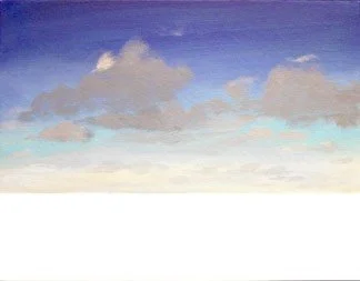
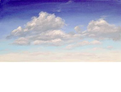
STEP 2
The shadow colour for your clouds will vary as normally you will have
decided to use the clouds in a landscape for which you already have
chosen a colour relationship, so use a tonal strip and try to assess the
values first. Using this 0-7 scale, I decided to aim for 5-6 for the darkest
blue and graduate down to a 1- 1.5 value for the horizon colour.
Note that that spot of what appears to be very white is actually the grey
from the lower distant clouds.(looking relatively lighter against the
darker grey and blues). I dropped it in now to show how the relative
background tones vary greatly from horizon to zenith (uppermost sky).
Most acrylic paints darken a whisker as they dry, so you can work up the
3D shape of the clouds gradually with successively lighter greys until
you are arriving at white or near to it.
I made my medium tones of blue about a value of 4 and I will aim to
make the darkest grey of the cloud tones about the same or a tiny bit
darker, tinting a little bit for the smaller more distant clouds. I am
mixing my cloud grey with burnt umber and ultramarine, if you want a
different grey colour, make one that will fit with your scheme.(hopefully,
you have studied rich greys and how to mix them, if not take a look at
Colour Made Easy module, which is available online or comes included
in the Colour Workbook.) Get your Colour mastery on!
Next, softly scumble the shadow shapes in, with a minimum of paint
on the brush.
Just try to establish the overall shapes of the cloud masses. You don’t
need to stress about each individual cloud, but the nature of a cumulus
cloud should evolve.
I have noted and stuck to the light source in the photo. It is essential to
be consistent in this area.
STEP 3
I have now started to scumble in a very light grey in the areas where I see white (I will add white eventually but will build the tones up to it gradually.)
Since this is the final refining stage of the sky, I will now make up a small amount of each colour and tone that I have already established, including the blues and set about refining the finish.
Some artists are very loose in their painting of clouds, simply hinting at cloud. There are many kinds of clouds and even more approaches that are possible for including them in your paintings
I am going to use this sky to add in a scene to illustrate aerial or atmospheric perspective. (If you got the Landscape bundle of 5, this little module is included). It is not just in a landscape that we need to understand the strategies involved in creating depth perspective in painting.