Koi painting in layers
REFERENCE
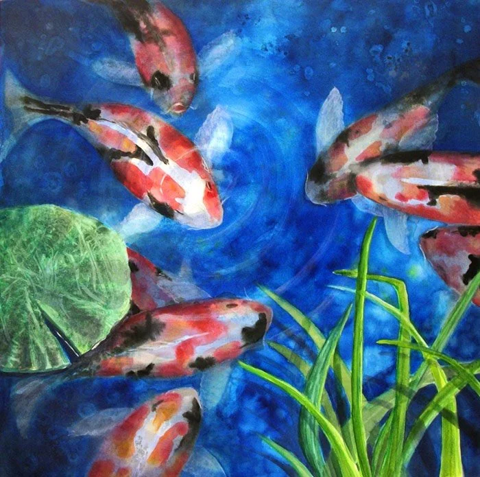
You can use the finished painting here (right) as a reference or better still, find some koi pond references and create your own composition. This one was done from various fish references because the photo I took of my son's favourite fat koi in our resort in Bali disappeared from my camera (someone took 100s of photos of geckos and I suspect, accidentally deleted my photos!!)
In this practical project, you can use watercolour paper or canvas, with some slight variations in technique depending on which substrate you choose. I used a 60x60cm square 'watercolour canvas' because I am currently testing it out from a new supplier. The canvas surface gesso is more absorbent than normal canvas but does not behave exactly as watercolour papers (the pigment lifts off much more easily). Because of this, I use a matt spray varnish after I am happy with the first layers all over. Then I deepen glazes and strengthen tones with transparent acrylic glazing. I use a paint-on matt acrylic glaze varnish then before framing in a floating frame.
BUT..for the purposes of this project, if you are using watercolour paper, choose a heavy cold-pressed sheet and follow the stages as per normal here except for the final matt glazing phases (which were necessary for me as the canvas does not grab the pigment the way papers do).
READ THROUGH THE STAGES FIRST, GET EVERYTHING READY, AND THEN WORK THROUGH STEP BY STEP.
STEP 1. Firstly, I used a watercolour pencil to draw in the koi, lily pad and reeds. Many watercolourists use graphite to draw in, but if it is under a very light wash it will show and it won’t erase easily. You can buy watercolour pencils in a set or individually, so they are a cheap and practical tool for sketching in and can also be utilised for adding interesting details and textures along the way sometimes.
I painted on a watercolour canvas, but you can undertake this project on paper instead if you prefer
(To create a balanced and pleasing composition of your own, if you have no compositional design experience yet, please make a point of taking yourself through the Module on Design and Composition, if you are not sure about arranging, this will really help you independently create well-balanced, interesting arrangements of your own, with a clear focal point and clever design.)
2.At this point I have laid down water first, in red-orange (like vermillion or cadmium red light) into the patches of colour in the koi, and while still wet I have dropped in cadmium yellow in some areas and deep quinacridone red into other areas.
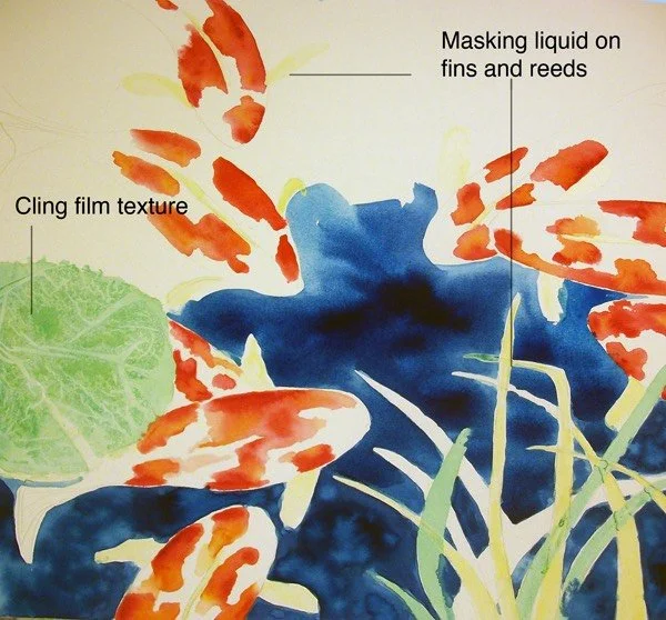
3. The yellow you see here is a dried latex masking medium. You can buy a transparent one (much harder to see later) but handy if you use very soft papers which can be stained sometimes by the regular latex masking fluid.
I always use heavy papers, but you will develop your own preferences, best to try them all.
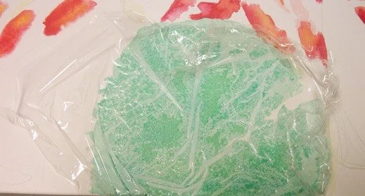
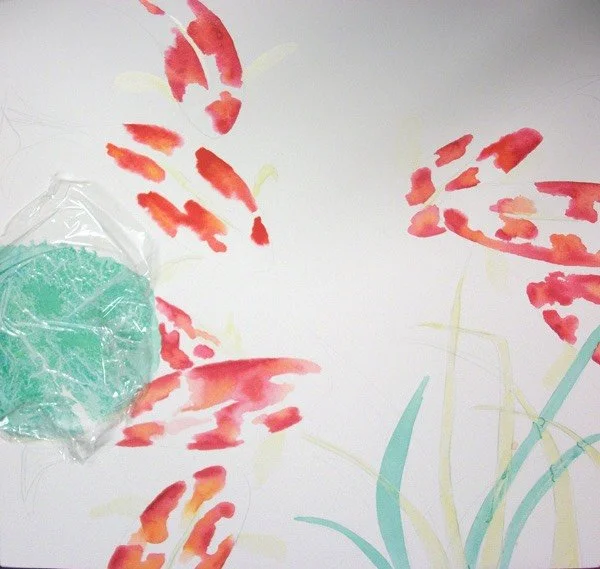
4. Have a close look at the lily pad. I have used cling film over a strong, green wash and left it to dry. You may have seen this texturing technique and others in the Paint Application Techniques Module.
Actually, later on I did another layer in a darker green.
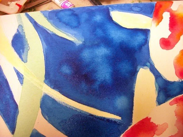
5. At this stage below, you can see I have started to drop phthalo blue in and around the fish, reeds and lily pad. It is best to lay down water carefully first, then make up a good-sized puddle of strong wash and drop it into the wet areas (the latex will keep your white paper clean and careful strokes laying down water in other areas will guide the pigment neatly where you want it to go). Because you are going to use some backwash technique soon, heavier colour is ok.
6. Here below is a close up to show how I dropped in some water as the blue was starting to lose it's sheen, creating small backwash 'blossoms', an undesirable accident for some beginners but an wonderfully effective texture in some situations
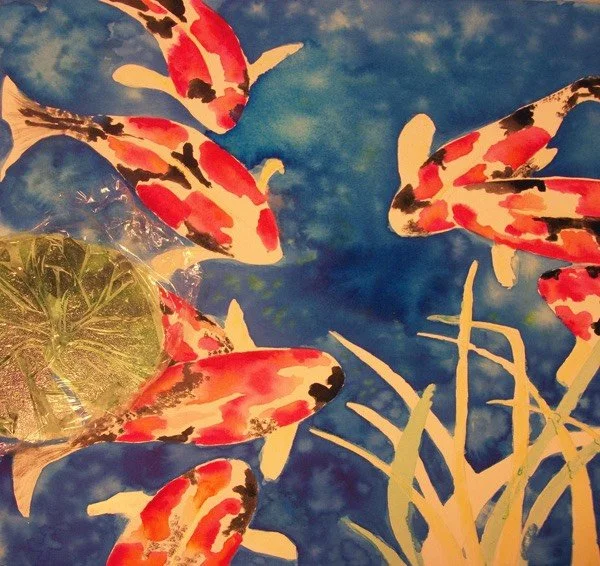
7. Now I am on the home straight, you can see the second layer has gone onto the lily pad, as I wanted to overlap the textures and create an even more interesting surface.
8. Now I have added in black patches onto the koi, in some places I have stippled as the texture on 'our fish' in the black areas was like this.
9. At this point, once dry, you can now rub and roll off the latex masking frisket on the fins of the fish.
11. Other final details you will see in the end result below were :
- eyes (mouth on one), whiskers on a few (not all koi have whiskers but my 10-year-old loved the whiskers, so in they go)
- a splash of reflected light near the lily pad (lift-off) and the central ripple near the main fish (I did the ripple in acrylic, after spraying matt varnish, then painting a layer of liquid matt varnish) because I did this watercolour on the w/c canvas which does not allow as many glazes as good quality watercolour paper. On paper you could use diluted Chinese white at this point,to add the subtle ripples, some would use white goache or gesso which is pretty much doing the same thing(opaque) but it must be very dilute.
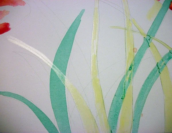
- add some more dark, medium and light tones on the reeds, plus a few cast shadows here and there.
10. I used a small stiff worn down hog hair brush to lightly scrub and lift out the extra details on the fins (note: different breeds of koi have differently shaped fins). To make sure that they look like they are moving underwater, I refined the fin edges with a very dilute chinese white (very traditional watercolourists did/do not use this as it is technically a gouache, but it is very handy in some applications. As you can see it has taken away the hard edges (I also did an overall thin glaze of blue, deepening it again in the darker areas (actually I threw on some rock salt while it dried to add in extra textures here and there. Don’t use phthalo for the glazing part if you have a non-staining blue, like blue-violet, cyan or cobalt, this is better for watercolour transparent glazing on paper.

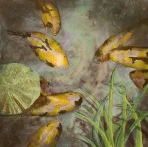
Some alternative colour schemes